Case Study: Crafting a Standout Brand for Mitch’s Craft Kitchen
The Challenge
Mitch, the creative force behind Mitch’s Craft Kitchen, is known for his exceptional pickles and hot sauces, crafted with care in Ontario’s vibrant cottage economy. While his products were already a hit among friends, Mitch wanted to take things a step further by establishing a more official presence for farmers’ markets and private sales.
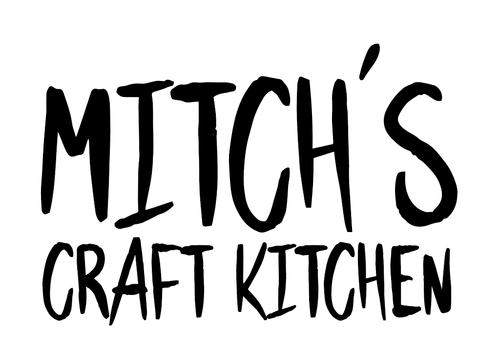
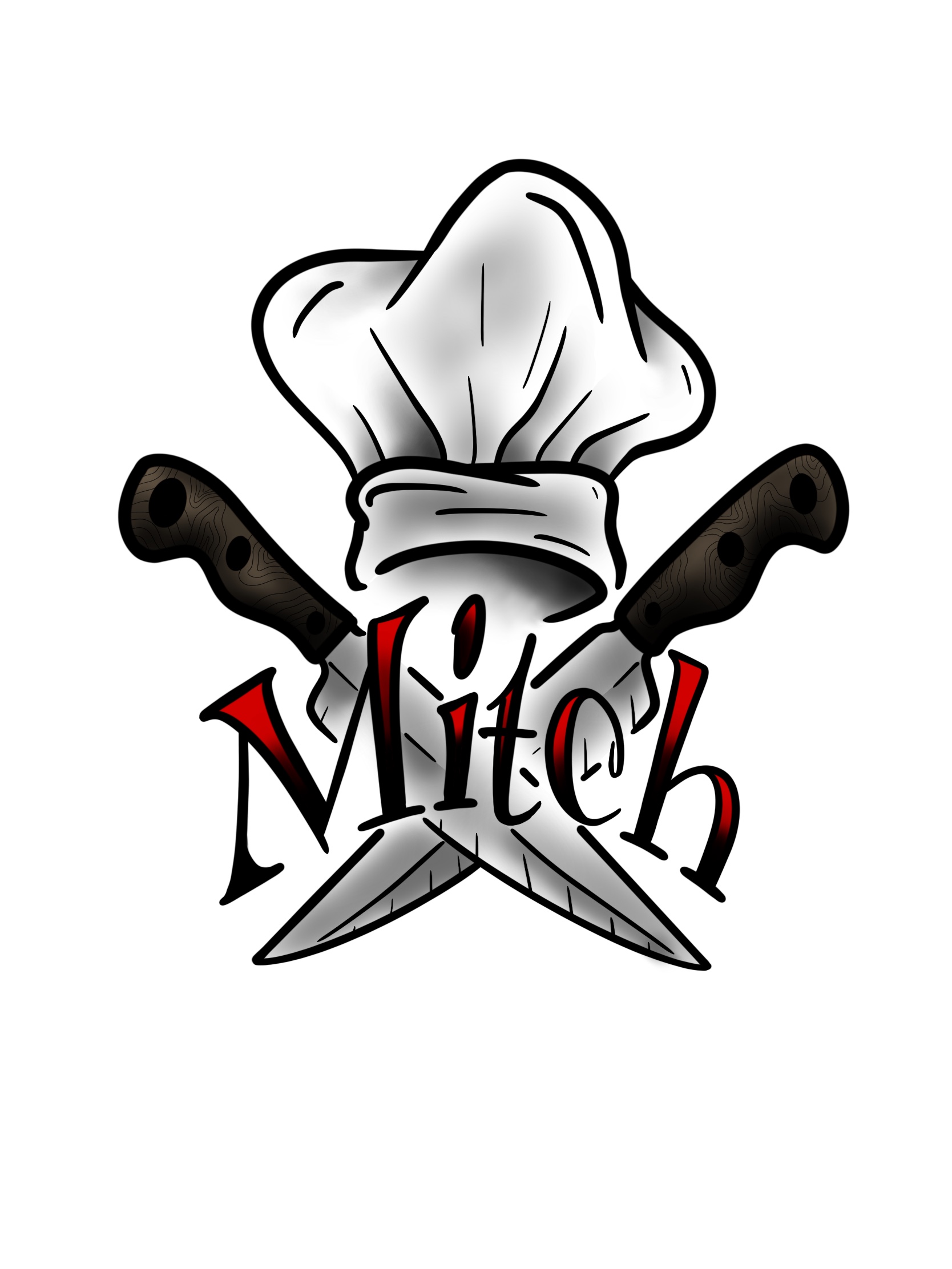
He started with a logo designed by his trusted tattoo artist, but the typography didn’t quite align with his vision. Mitch needed a type treatment that honored the original design but elevated it for the competitive artisan food market.
The Solution
With the tattoo artist’s blessing, I stepped in to refine the design. My approach focused on enhancing the text to:
- Maintain the Authenticity: Keep the spirit of the original artwork, ensuring Mitch’s unique brand personality was preserved.
Ensure Market Appeal: Develop a bold and polished type treatment that would resonate with customers at farmers’ markets.
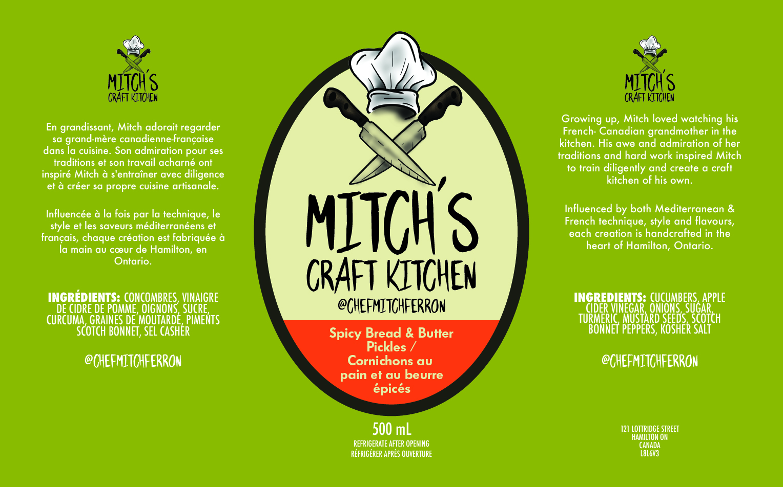
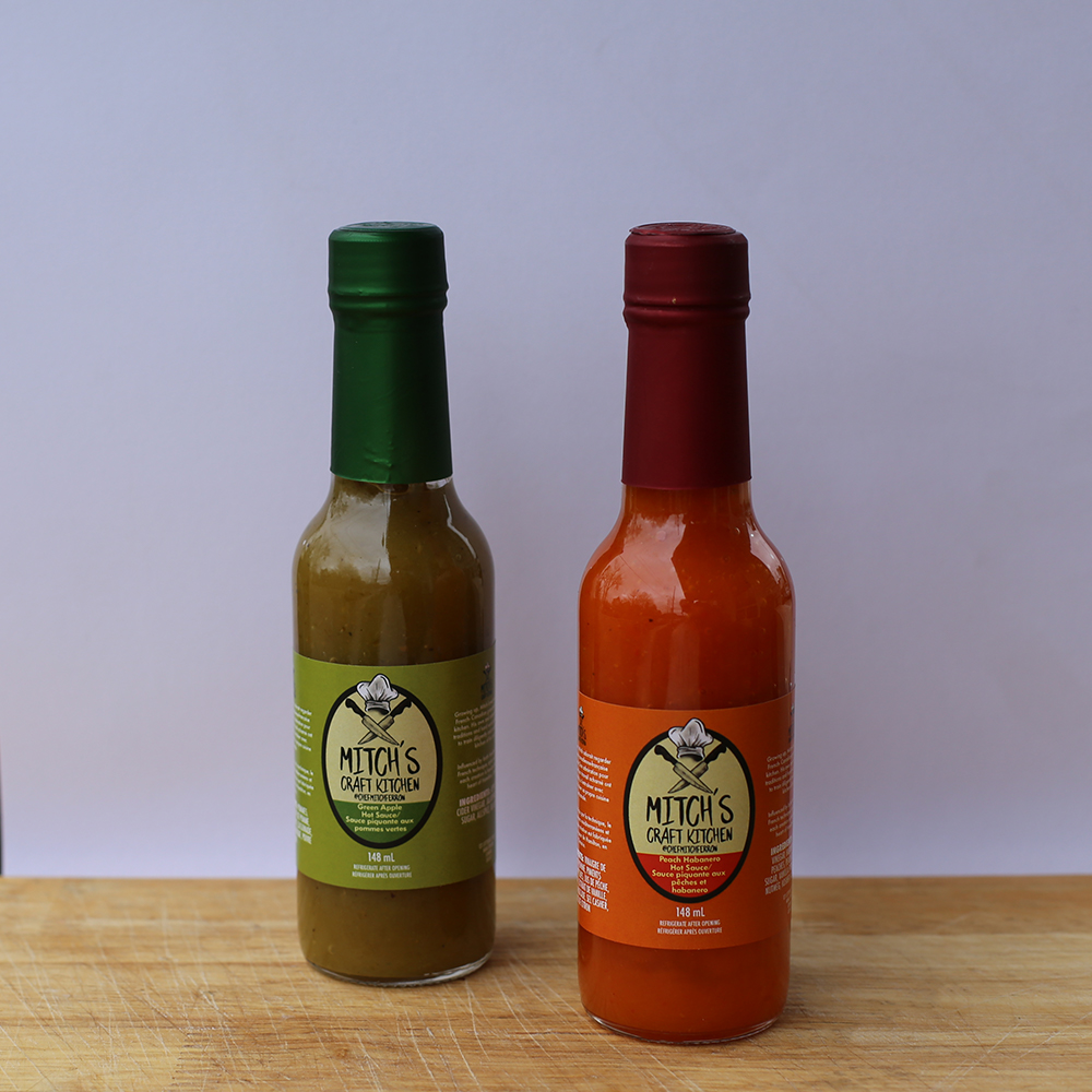
Balance Aesthetics and Functionality: Design text that complements the artwork while standing out on labels and packaging.
The Process
Understanding the Brand: I explored Mitch’s vision for Mitch’s Craft Kitchen, ensuring the typography aligned with his rustic yet modern vibe.
Collaborative Refinement: I worked closely with Mitch to adapt the original logo, experimenting with fonts and layouts that felt relevant to his product offerings.
Design Execution: After narrowing down the options, I crafted a clean, versatile type treatment that complemented the tattoo-inspired design and reinforced Mitch’s brand identity.
The Outcome
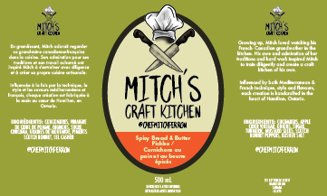
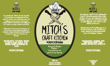
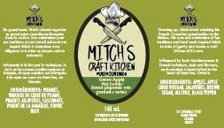
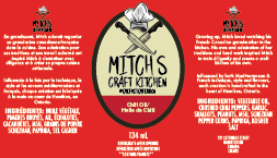
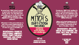
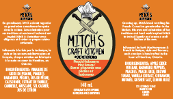
The refined logo seamlessly combined the original artwork with a custom type treatment, giving Mitch’s Craft Kitchen a professional edge. The new branding now turns heads at farmers’ markets and helps his products stand out, reflecting the care and craft that Mitch pours into every jar and bottle.
This project was a testament to the power of collaboration and thoughtful design in bringing a cottage-industry brand to life.
I agreed with Mitch. There really wasn’t a way to make Mitch’s Craft Kitchen work with the current hand-drawn type treatment. So, I altered the old logo with the artist’s permission to give it a clean slate.

