Jesse Parent — Logo Design
The Problem:
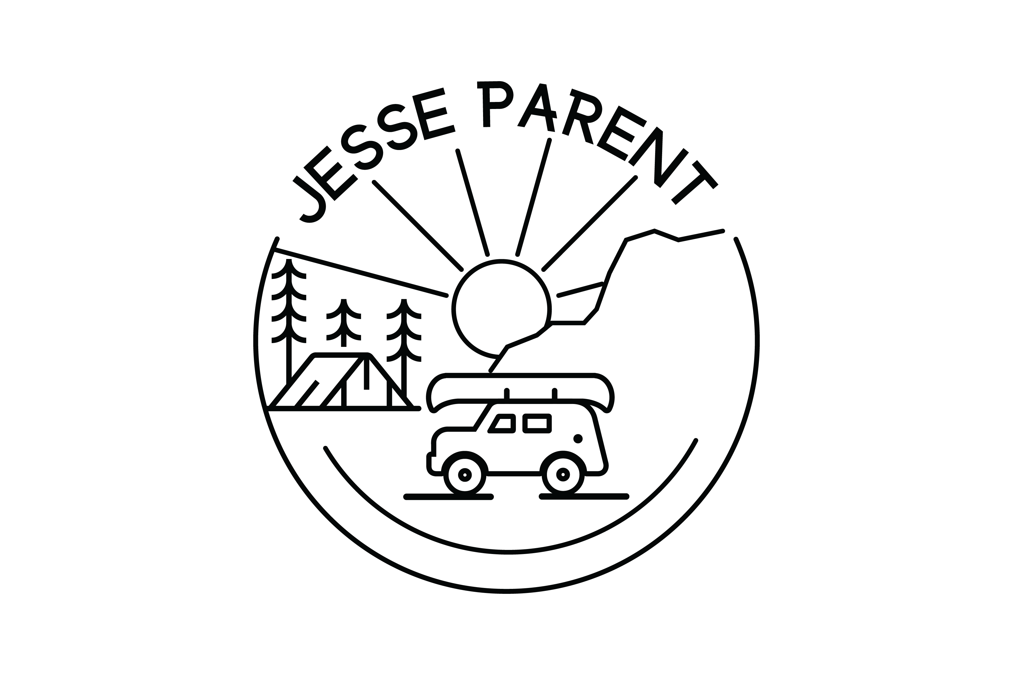
Jesse came to us needing a logo. Branding is becoming increasingly important for musicians, even though the landscape for promoting music is ever changing. Jesse wanted his love of the outdoors to be evident in his identity with camping and maybe a canoe.
Process:
We interviewed Jesse to find out if he had any ideas via our questionnaire. It was through this where we learned about how Jesse viewed himself, his audience, and how he wanted his brand to be perceived.
Loyal, Rich & Warm Vocals, Trustworthy, Authentic — and when you listen to Jesse’s music it all makes sense.
We then did an exploration of the visual language, symbolism, and meanings in Jesse’s document. It’s a bit of a crude mind-mapping but it is important in shaping the aesthetic direction.
Then we analyze the competitive landscape. First we want to know who Jesse’s competing with for fan loyalty, we also want to develop a brand that gets attention while remaining relevant.
Next we pick the main themes that are going to guide our explorations and start playing with imagery.
Once we’re starting to see dominant directions, we bring typography into play. Typography is the tone of the voice of the brand.
Next we explore colours and their relationships to each other, emotions, and cultural- and social associations.
We presented Jesse with 3 distinct directions depending on how much weight he wanted to place on the different values. We decided that one would be a dominant logo, and he would have more playful “fan-art” inspired secondary logo for merchandise.
The Result:
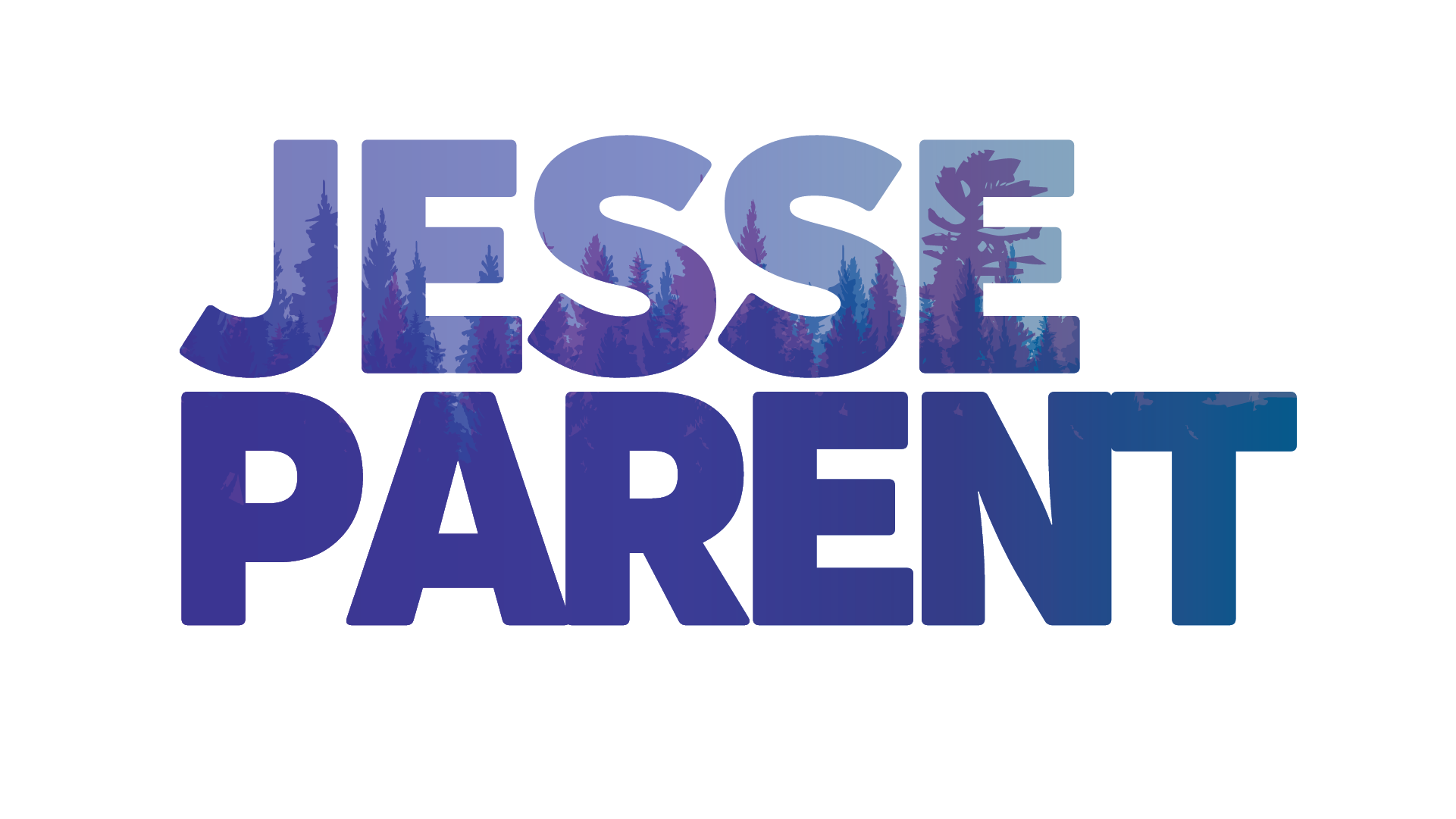
For this unique project, Jesse ended up with a bold, layered, dynamic primary logo that reflected the loyalty to his love of nature, his family, and his fans.
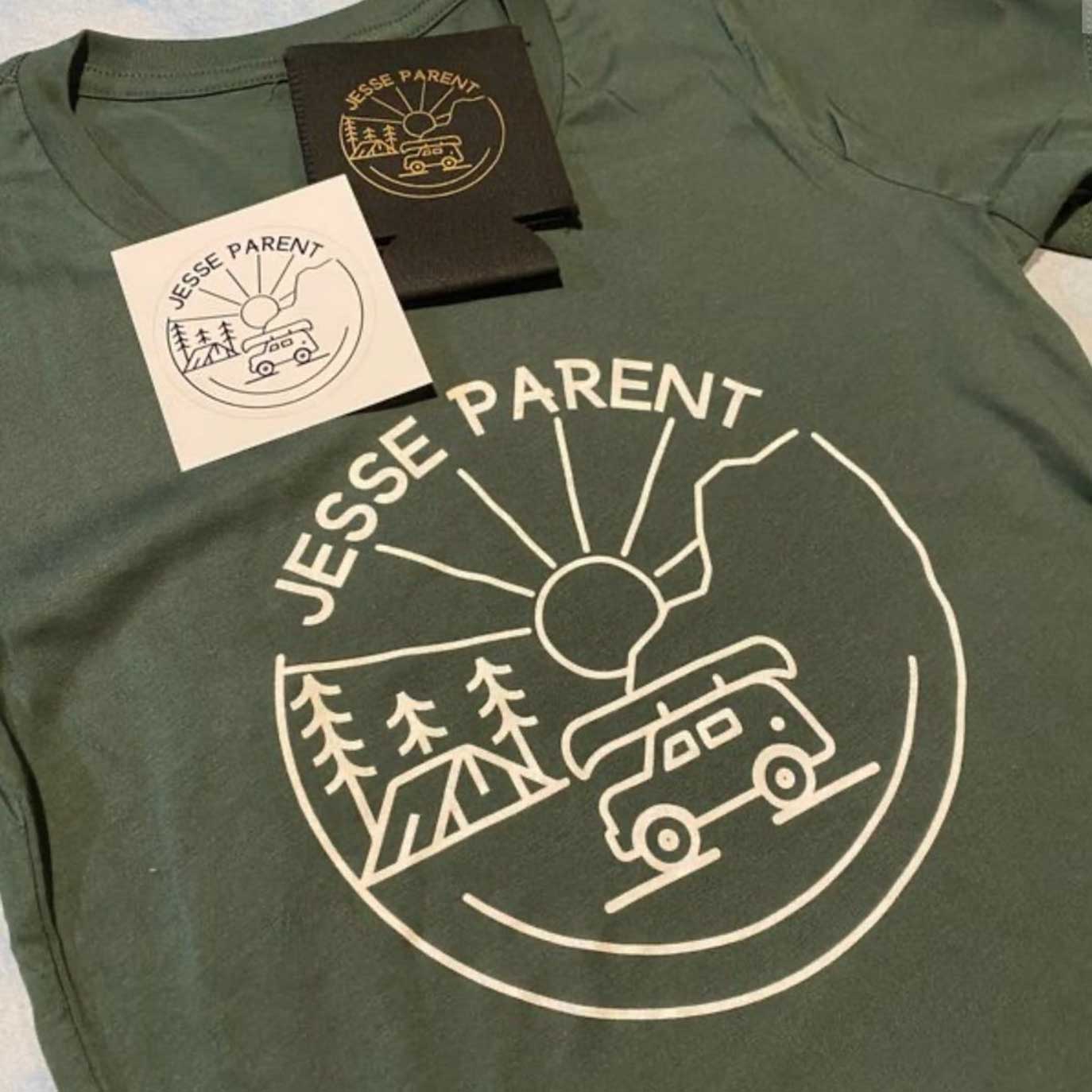
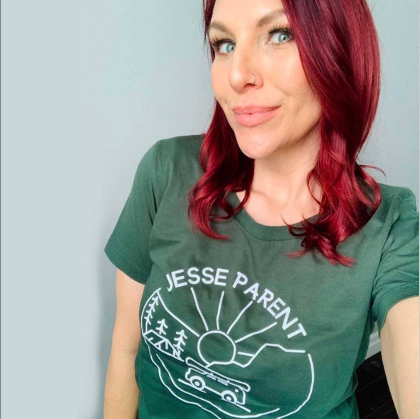
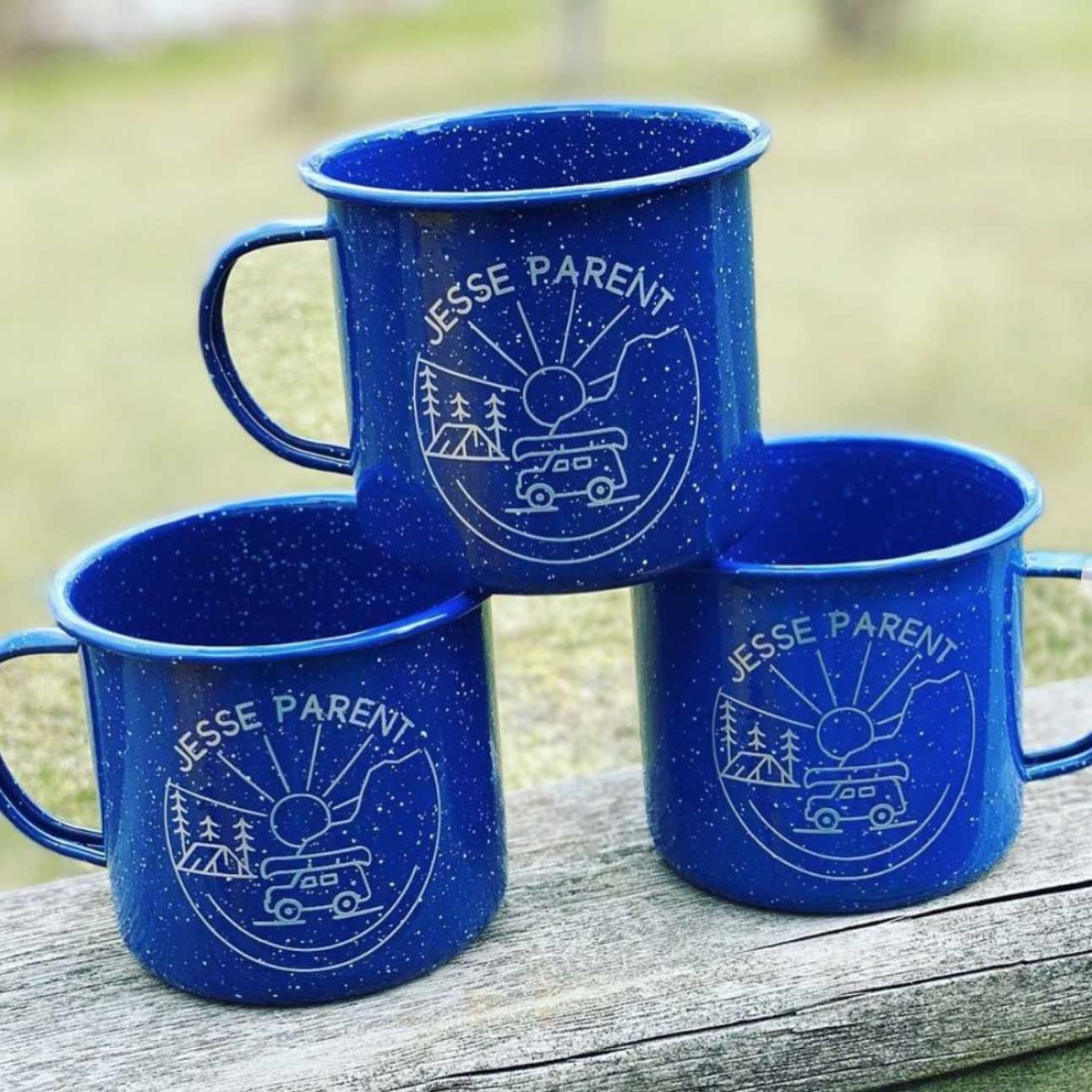
His secondary logo for merchandise reflected more of a camping patch line art. Of course both could be used for merchandise, many artists have different styles for their merchandise.
–Danielle, Ballad Creative
Merchandise Design
Main Logo
4 Variations were created for posters, web, merchandise.

